How Developers Pair Heras Fencing Covers and Building Wraps
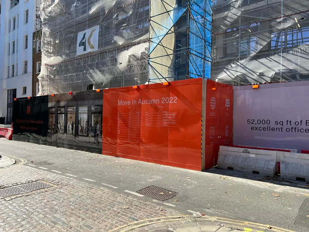
Walk past almost any major development in a British town centre and you will notice two layers of messaging working together. At street level, the perimeter guides pedestrians and screens the work behind it. Higher up, the scaffold carries something bolder, often a full-height image of the finished scheme. When both layers are planned as one, the site feels deliberate and well run. When they are not, it looks patched together. Here is how developers approach that pairing, from early planning right through to the day the scaffold finally comes down.
Two Viewing Distances, One Story
Developers tend to split a site into two zones. The ground-level zone is seen up close by people on foot, cyclists and drivers waiting at junctions. Messages here can afford detail: contact numbers, safety notices, opening dates and directions around the works.
For this zone, Heras fencing covers do most of the heavy lifting. They turn a run of temporary mesh panels into a clean printed surface, hide stored materials and give neighbours something more pleasant to look at than bare steel.
The elevated zone is different. It is seen from across a square, the far side of a high street or the top deck of a bus, so it needs scale rather than detail. That is why the scaffold graphics and the fence graphics are best designed side by side rather than months apart. If you want to see just how dramatic the upper layer can be, there is a useful read on how a full-scale scaffold wrap can transform the way a construction site looks from the street.
Starting With a Shared Design Brief
One palette, two scales
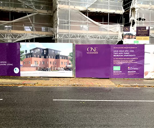
The simplest way to connect both layers is to agree a single colour palette, typeface and logo treatment at the outset. The fence artwork can then pick up details from the larger image above, perhaps a cropped section of the CGI or a band of the same brand colour.
Different jobs, different content
Avoid repeating identical artwork at both heights. Up high, one striking image and a short line of text works best. At street level, people have time to read, so this is the place for site safety signage, a project website and a phone number for enquiries or complaints.
Material Choices That Work Together
For the fence line
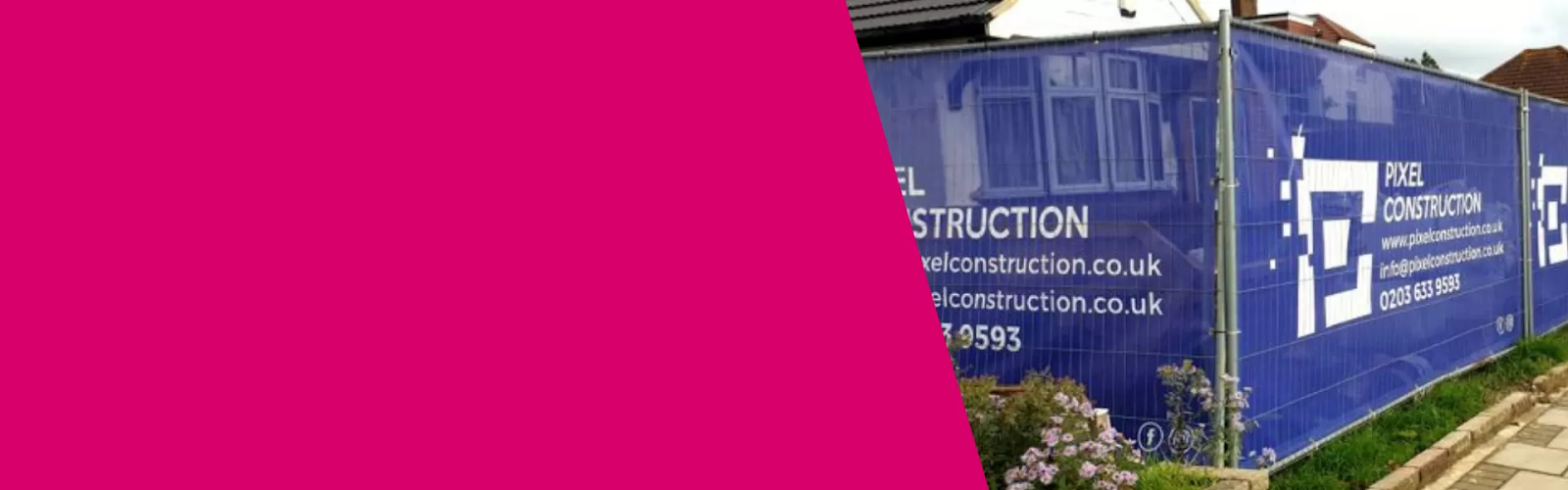
Mesh-backed PVC is the usual choice because it lets wind pass through without turning a fence into a sail. Look for reinforced hems and brass eyelets, and fix with cable ties at every eyelet so the graphic stays taut. Well-made heras fencing covers can be unclipped, rolled up and moved when the site boundary shifts, which happens more often than most programmes admit.
For the scaffold
Large elevations usually call for mesh too, often a lighter grade on very tall structures. Building wraps above a certain size may need a check by the scaffold designer, because the added wind load affects ties and bracing. Where the building is occupied or close to neighbours, ask about fire-retardant scaffold mesh as standard.
How the Pairing Plays Out Over a Project
- Enabling works: the fence goes up first, usually with simple branded graphics, a holding message and contact details.
- Superstructure: once the scaffold is complete, building wraps go on to show the finished scheme, and the fence artwork is refreshed to match.
- Sales and lettings: marketing messages are added at street level, often with a QR code pointing to a show home or marketing suite.
- Completion: the scaffold is struck, but the fence often stays for landscaping, so its graphics shift from "coming soon" to "now open".
Common Pitfalls to Avoid
Even experienced teams slip up when the two layers are commissioned separately. The most frequent problems include:
- Ordering fence graphics months before the scaffold design is agreed, then discovering the colours clash.
- Cramming the elevation with text that nobody can read from fifty metres away.
- Forgetting that fence panels get moved, so a design that only works in one fixed sequence soon falls apart.
- Choosing cheap heras fencing covers without reinforced hems, which split at the eyelets in the first gale.
- Leaving faded graphics in place long after the message has changed.
Final Thoughts
The most memorable sites rarely happen by accident. They come from a shared brief, sensible material choices and artwork that suits each viewing distance, all planned before the first panel goes up. Treat the perimeter and the scaffold as two chapters of the same story and the whole development looks more professional, more considerate to neighbours and more appealing to future buyers. If you are planning a scheme and want both layers to work in harmony, Hoarding Print Company can help you shape the brief and get the details right from the start.

Comments
Post a Comment